The whole specification shebang!

The whole specification shebang!
8.2.22
Our first job for a fab new client and boy did they entrust us with a biggie!
Full internal spec for their first major London resi scheme……
ok, so no pressure then!
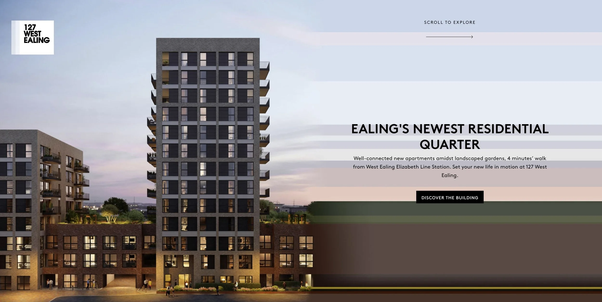
106 x 1, 2, 3 & 4-bedroom apartments in a super-convenient location a few minutes’ walk from West Ealing station. And this really is a few minutes’ walk, not a ‘marketing few minutes’ which we all know in real life is a mini marathon!
As always, first task was research – lots of it. As expected, the biggest USP that jumped out was connectivity. It’s already great, but with Crossrail on the horizon it’s set to become an even bigger deal.
This is also the key focus of the marketing collateral, which has taken this theme and used a horizontal-stretch motif to really accentuate it.
We have taken this idea and translated it into all aspects of the internal specification. The focus has been all about the horizontal lines and accentuating those wherever possible. The word ‘horizontality’ may have been dropped quite a few times in client presentations! Not sure if the OED are gonna add it in as one of the words of 2022, but we’ve definitely caught the client saying it a few times now!
In the short term this design language provides a very clear synergy with all the branding (ensuring a seamless customer journey) but further down the line, once the marketing phase is done and dusted, the design language will remain relevant and authentic given connectivity is such a key part of the development.
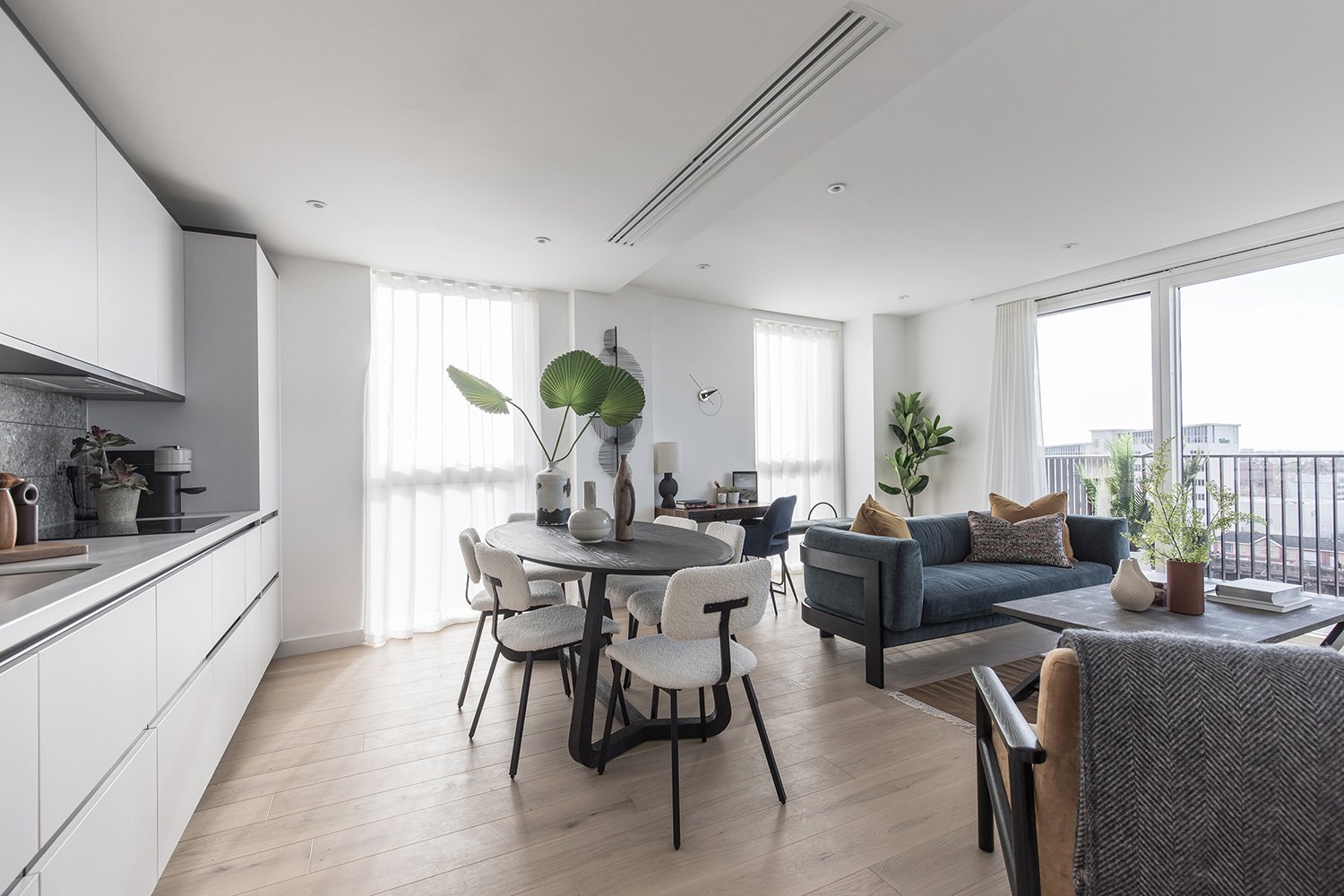
The design comes through in a similar way to the marketing – a strong emphasis on multiple horizontal lines. As ever, within the apartments it’s in the kitchens and bathrooms where the design language is used the most, and the communal areas are where you get to dial things up even more………
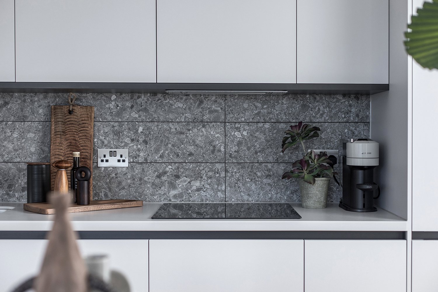

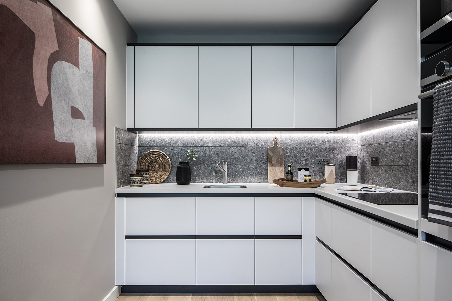
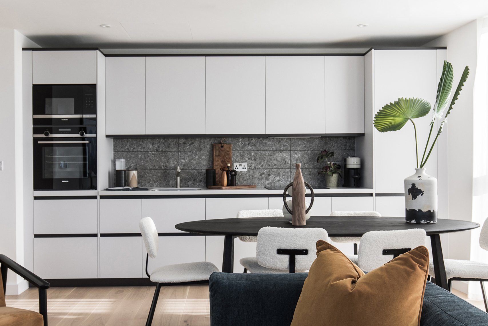
KITCHENS
There’s no mistaking the design language in these kitchens!
Units are handleless in a matt, soft-grey finish with a strongly contrasting anthracite inset rail. The horizontal detail is hammered home on the base units by the use of deep drawer units throughout,
rather than any cupboards - this gives the extra horizontal line running through the middle. The line is then ‘faked’ where single doors are used under the sink and on the dishwasher.
A matching anthracite plinth along the base units plus same colour plinth and cornice detail on the wall units nicely frame the entire kitchen. Splashbacks further emphasise things with the use of a large plank-format tile laid horizontally.
This is a pretty awesome aggregate-effect which adds some real depth, interest and texture to the design. Then just for good measure, the contrast dark grout rams home the horizontal a little bit more!
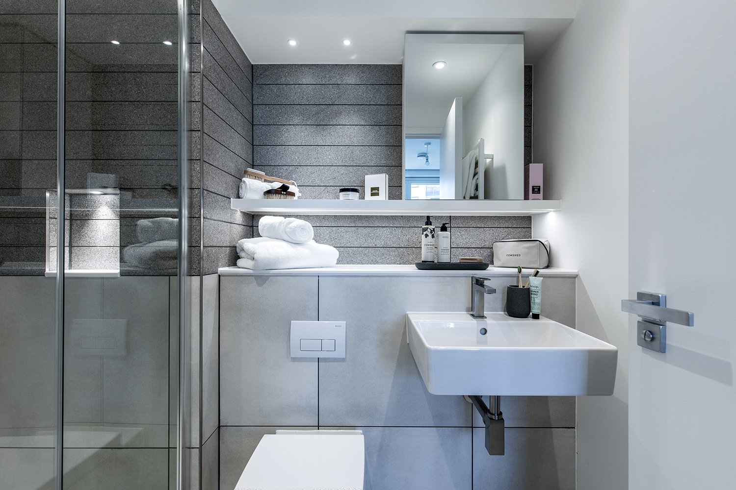
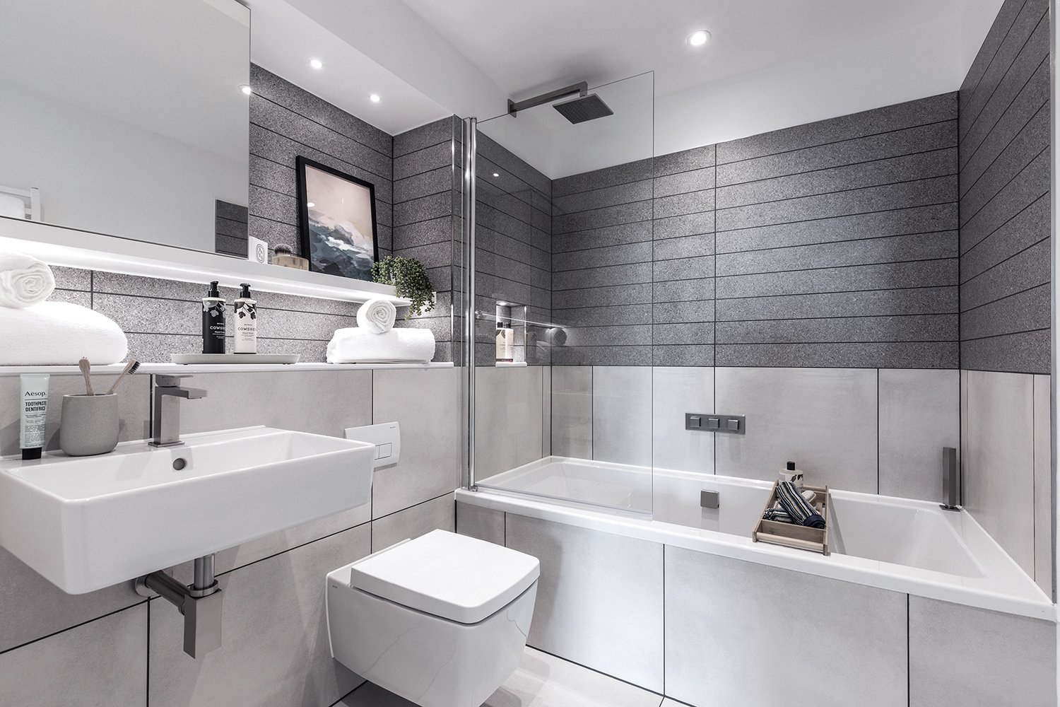
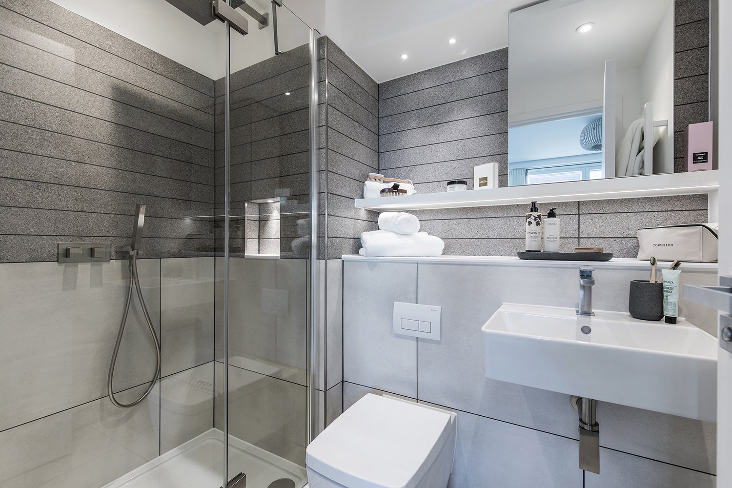
BATHROOMS
The bathrooms take the design language and run with it through the use of heavily horizontal tile formats and strongly horizontal bespoke cabinetry. It’s not just the obvious things though, it’s all those small details that subtly reinforce the DNA – the niche in the shower that perfectly lines through with the horizontal lines of the countertop and shelf, the tiling that stops short of the ceiling creating another horizontal line running around the room, the deliberately rectangular form to the loo and basin, the super straight form on the brassware….
Talking of the brassware – did we mention it’s all in a rather gorgeous bespoke brushed nickel finish? It brings a real richness to the scheme and sits beautifully with the soft-grey tones in the tiles. Naturally, the shower screen matches – you don’t think we’d miss a detail like that do you!?

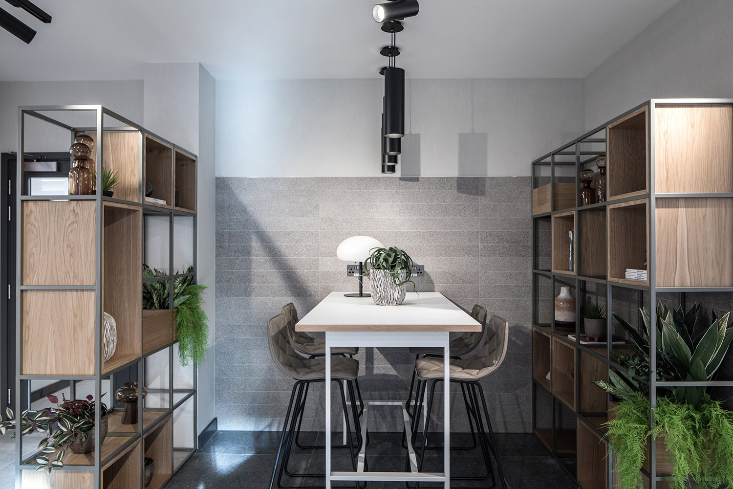
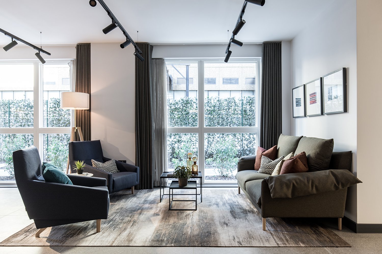
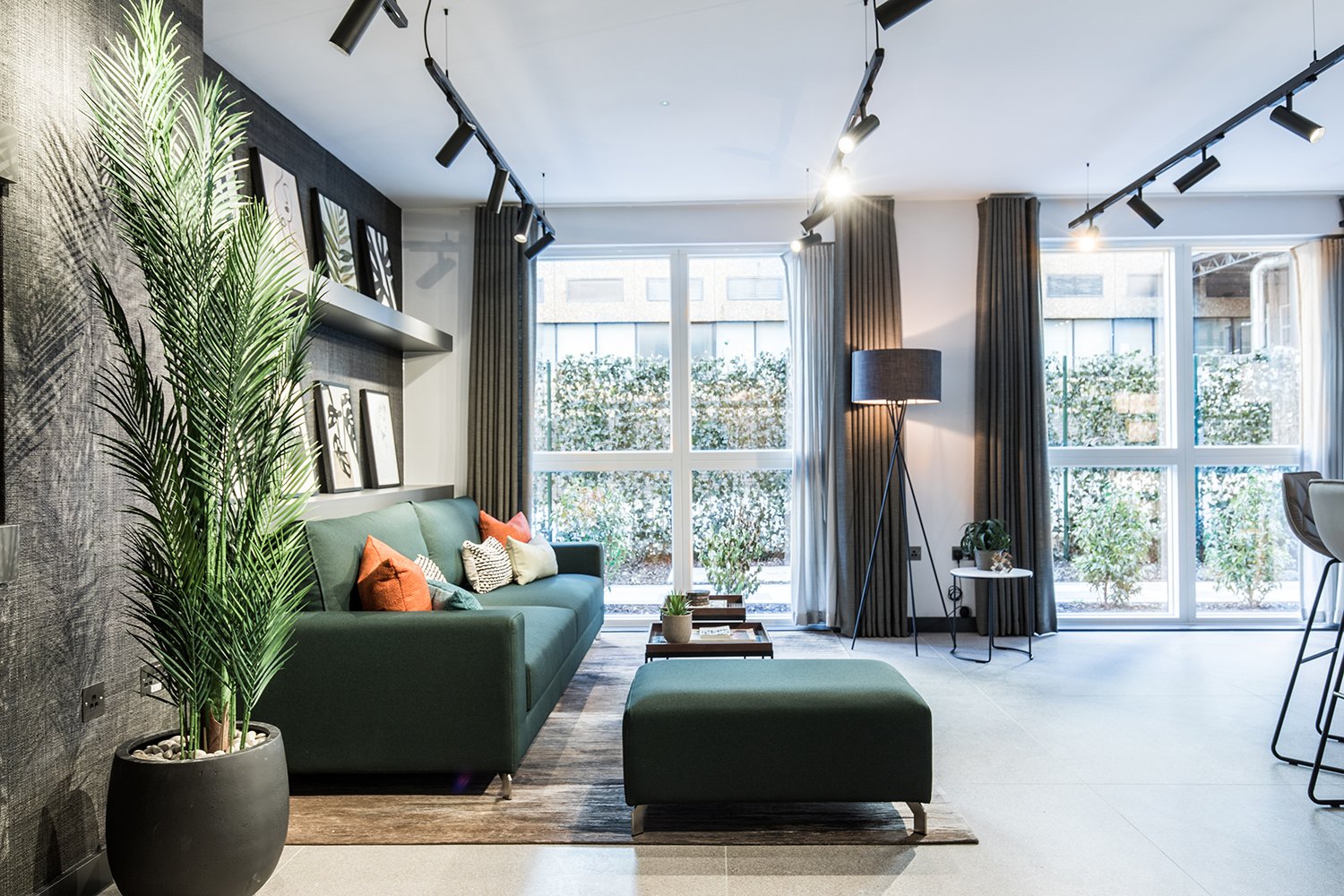
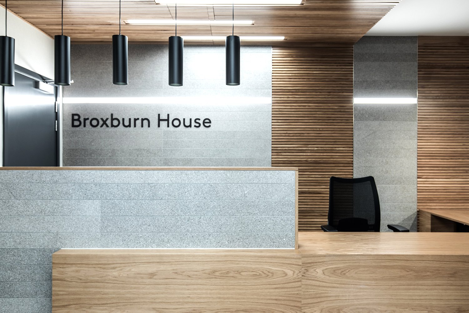
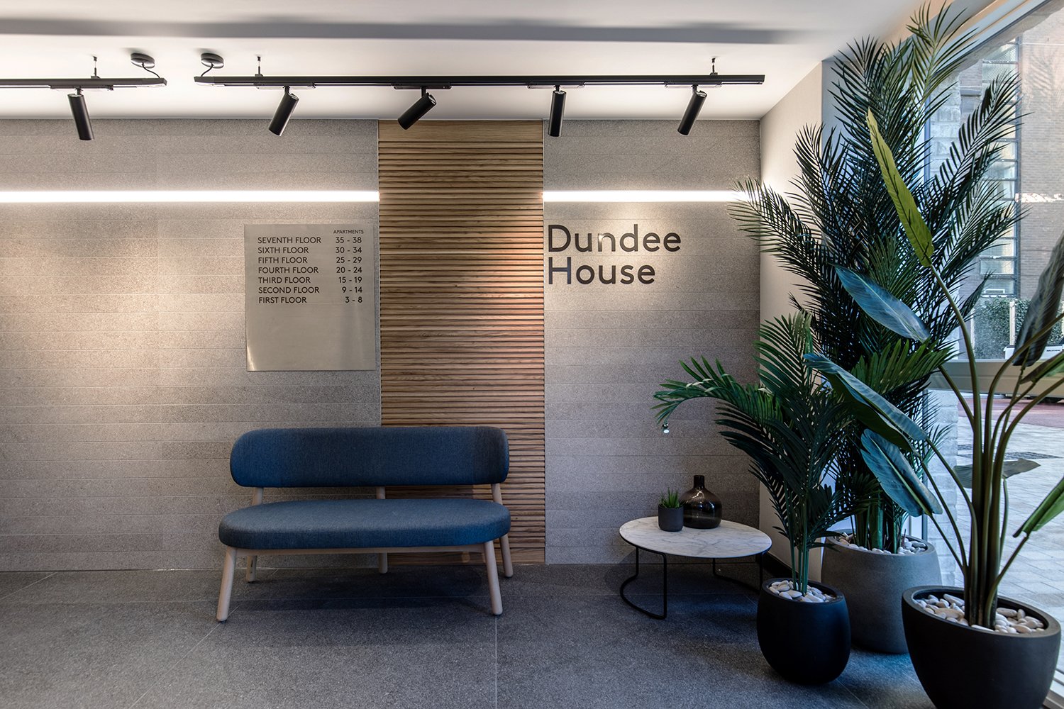
RESIDENTS AMENITIES AND COMMON AREAS
Along with the usual communal corridors and lift lobbies, this development has a really generous sized concierge space. It would have been really easy to just do a generic hotel-style lobby with loads of soft seating, but that seemed such a waste. There was definitely the scope here to get different functions in and give a few areas where residents could set up camp and do a bit of the old WFH. Considering we designed this space at the very end of 2019, it all now seems scarily prescient!

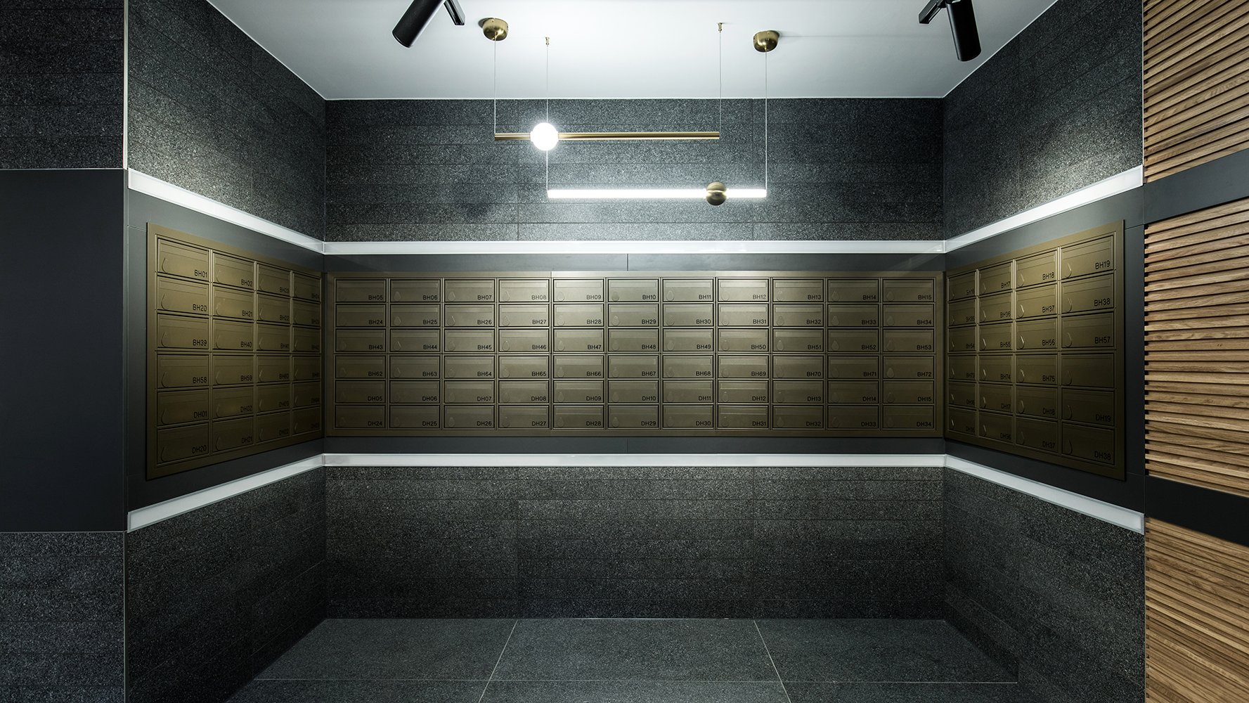
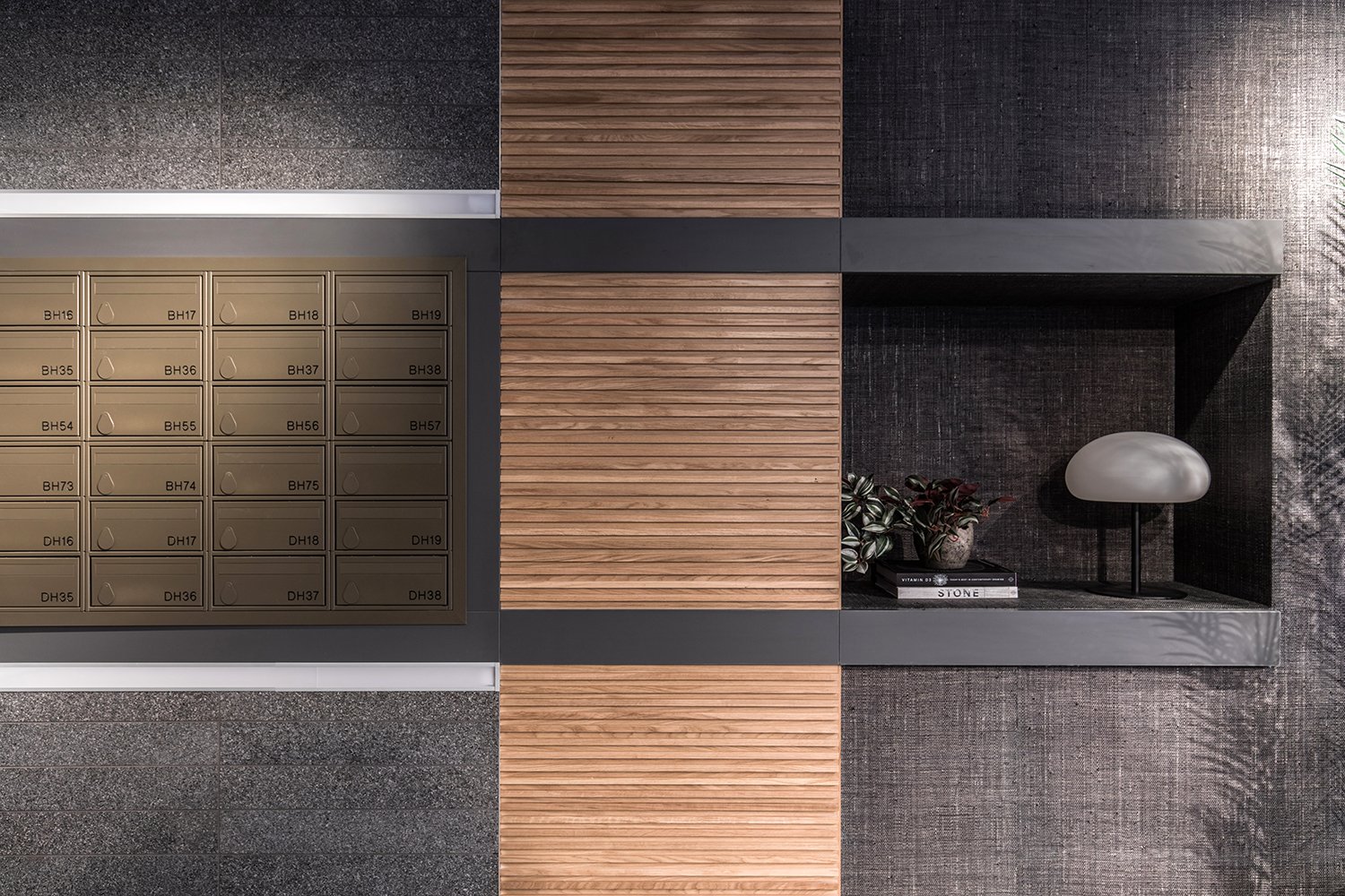
CONCIERGE AND POST BOXES
In the common areas the core DNA of the apartment spec has been taken and ramped up to a level that may have been overkill in more private spaces. We’ve deliberately used a lot of the same materials from the apartments, but in much larger formats and different colourways. Here we see concierge desks and bespoke joinery with strong horizontal grooves, combined with bold, statement lighting that continues the language to really tie in with the branding and connectivity. All in all there is an attention to detail that nicely pulls everything together.
And those post boxes. Who knew we would be waxing lyrical about a bank of post boxes, but don’t they just look incredible!

To subscribe to our monthly Newsletter and receive notification of new posts please go to SUBSCRIBE and select JOURNAL, thank you!