Which Colour of the Year?
Happy New Year. Happy New ‘Colour of the Year’
4.1.18
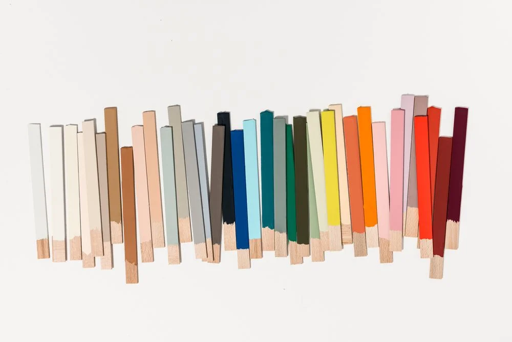
looking for colour inspiration for 2019? Google the term ‘Colour of the Year’ and you can kind of take your pick across the whole colour spectrum. So which colour are we supposed to be looking at? And why are there so many of these ‘colours of the year’?
There is obviously no better marketing ploy for a paint company than to announce a Colour of the Year (let’s go all Insta-slang-acronym and call it a COTY, shall we?). But who should we listen to and what colour shall we paint our house this year? That, dear reader, is up to you. If there’s a colour you like, then I’m pretty sure you’ll find a COTY somewhere around the world that gives you the confidence that you are current and on trend, but for a bit of design direction then take a browse through some of our selected COTY’s.
Pantone goes pink
Moving on from the blush pinks of 2018, Pantone moves us on a step or two with this brighter, more punchy version. Especially nice coupled with the crisp, clear, ocean blue in their own marketing material. As the arbiter of good colour taste Pantone tends to have the creative world hanging off it’s coat tails when they announce a COTY, so we all sit up and pay attention. And then go and fill a Pinterest board with images.

If It’s the blues you’re looking for…
..then look no further than Behr’s Blueprint, a tone they nicely describe as the “perfect middle of the road blue denim color- not too dark, not too light, slightly worn to keep it comfortable, but with enough color to be easily dressed up”, making it eminently useable and a perfect tone to mix with brighter tones of mustards and pinks, or darker, richer shades of navy and green.
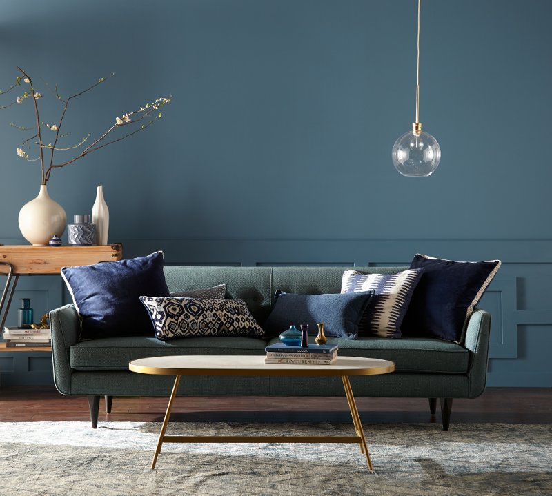
Or stick in a safety zone…
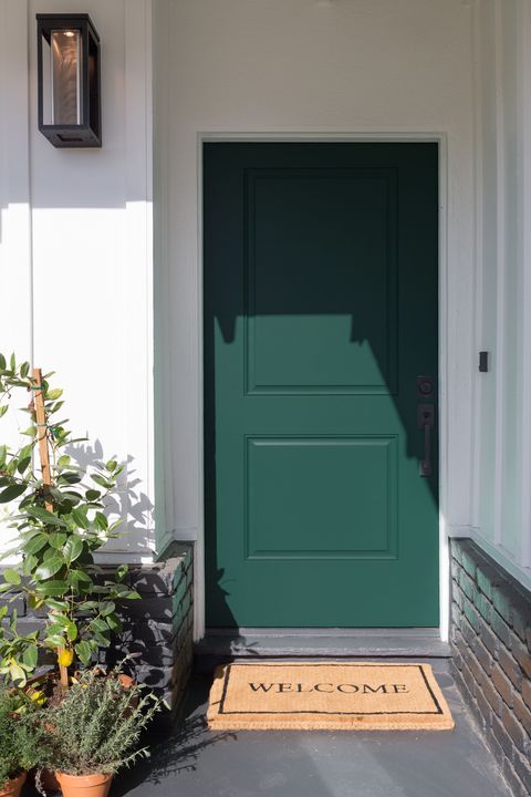
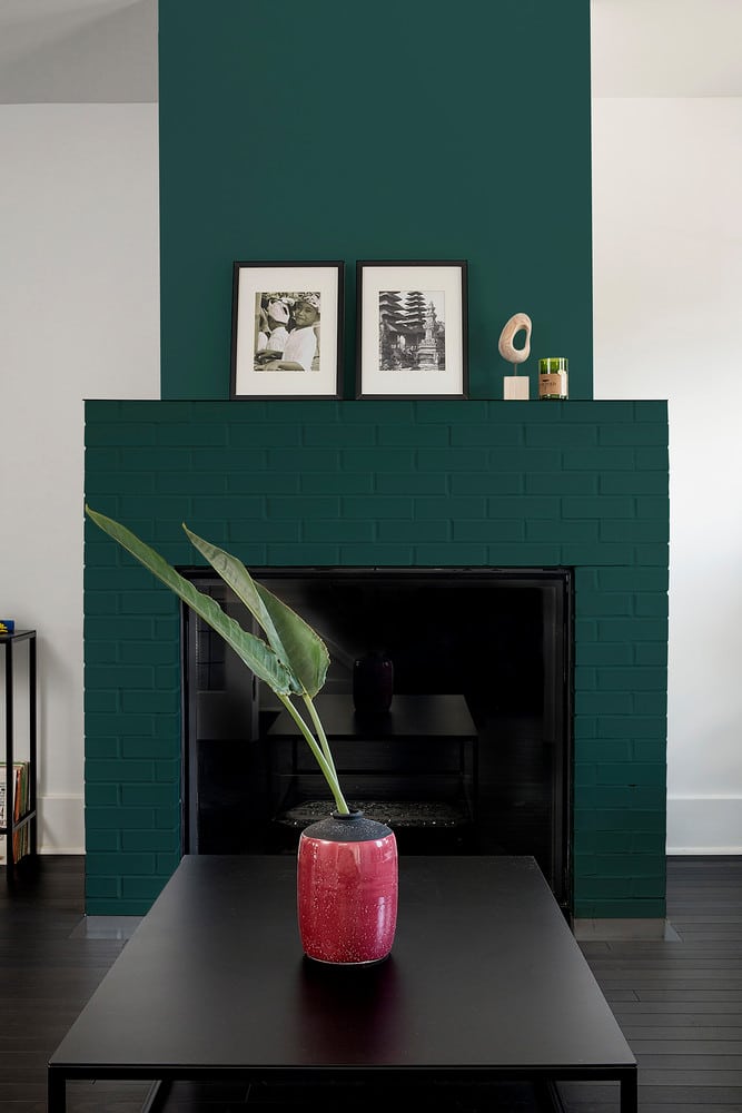
…with Benjamin Moore’s cool grey ‘Metropolitan’, which is giving the background colour of the last few years it’s fifteen minutes of fame, but which might need a bit of propping up by the other heritage-inspired shades in the Colour Trend 2019 palette, of which we particularly like Beau Green , Hunter Green and Hale Navy, to really stand out from the crowd.

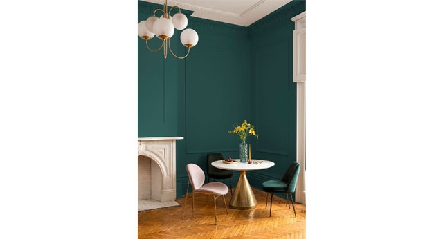
making a stronger statement
PPG brings us Nightwatch, a yummy rich blue bordering on petrol with a bit of green thrown in. Deep dark and moody, we think you should cover all walls with it and then bring it to life with accent colours born of brightness, fuschia pinks and bright yellows. All just a bit lovely, can you tell we like this one?
ONE COLOUR. Four paletTes.
Dulux are working on the premise that one background colour can be used across four palettes for four very different looks. We concur. Their Spiced Honey is a neutral of the most neutral kind and therefore entirely able to drop into any other colour palette without any problem. But as a COTY we are not sure it stands up to the competition.
And the rest…
There are other COTY’s out there. Valspar has gone for broke and chosen not one, not two, but twelve (yup, count ‘em, 12) COTYs, and not even twelve that are from the same palette (we hope). From an acid green and double-yellow-line yellow to more catch-all muted blues, blushes and purples, it really is a cover-all-bases approach to Colour of the Year.
Farrow and Ball, as ever, don’t conform to trend, they bring out new colours as and when they are good and ready. Considered and curated, and inspiring a confidence in every colour in their range with their timeless approach. Plus it must take them a while to come up with their lovely paint names. Cromarty and Salon Drab are our particular fave names from this years pickings.
So, even taking Valspar’s splatter-gun approach out of the equation, that’s quite a range to pick from, yes? We feel that the concept of Color of the Year has maybe become a bit problematic in relation to interiors, years seem to be going by at the speed of light and we are not likely to be repainting our homes annually to slavishly follow these prescribed ‘trends’. For more holistic interiors-inspiration look across the board, at texture and materials and finishes and fabrics, at accessories and lighting, and not just at a single colour. Don’t paint a room based on a recommendation once a year from a paint manufacturer, but consider what you want to use the room for, what mood you want to create in it and how you want to feel when you are in it. Then grab a paint deck and choose your own personal Colour of the Year. That’s the new rule. Every colour under the sun is a potential COTY, it just needs someone to write a blog about it and label it as one. Go for it.
To subscribe to our Journal and receive notification of new posts please go to SUBSCRIBE and select JOURNAL, thank you!