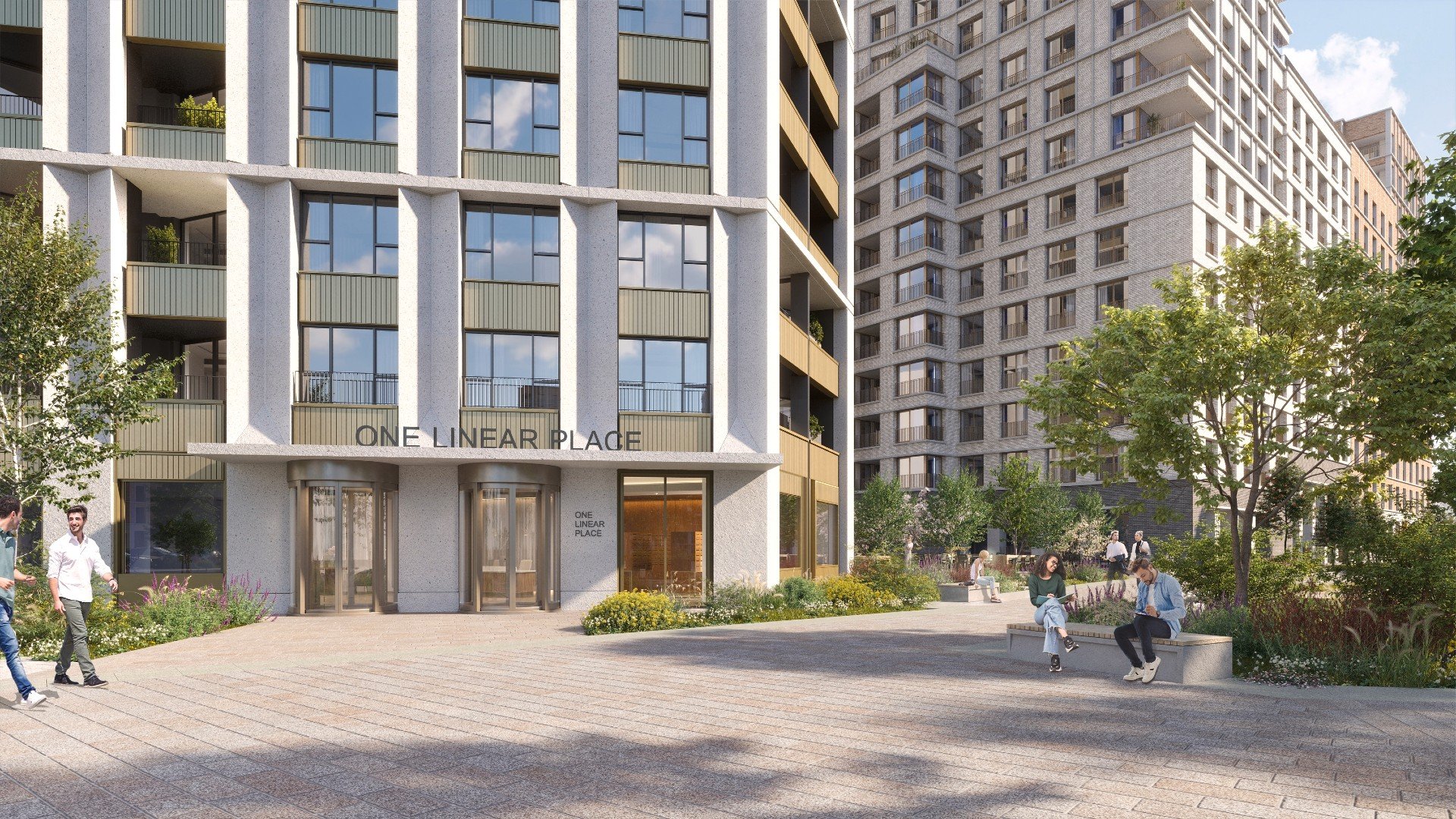
London Square Nine Elms

London Square Nine Elms
28.3.24
Well, this one was definitely worth the wait!
We’ve been dying to see London Square Nine Elms in the flesh and it’s not disappointed. It’s always so satisfying when a client goes to such great lengths to see through every detail of your desigN, and on this one, they really, really have.
The original brief called for two clear ‘looks’ to ensure there was customer choice, without getting into the realms of multiple options (and the logistical headaches that can bring). As the images so successfully show, the eventual light and dark schemes really do provide a distinct customer choice, but with a very clear shared design language.
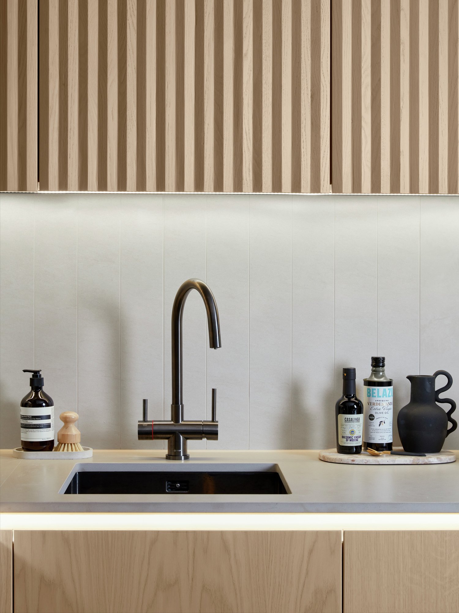
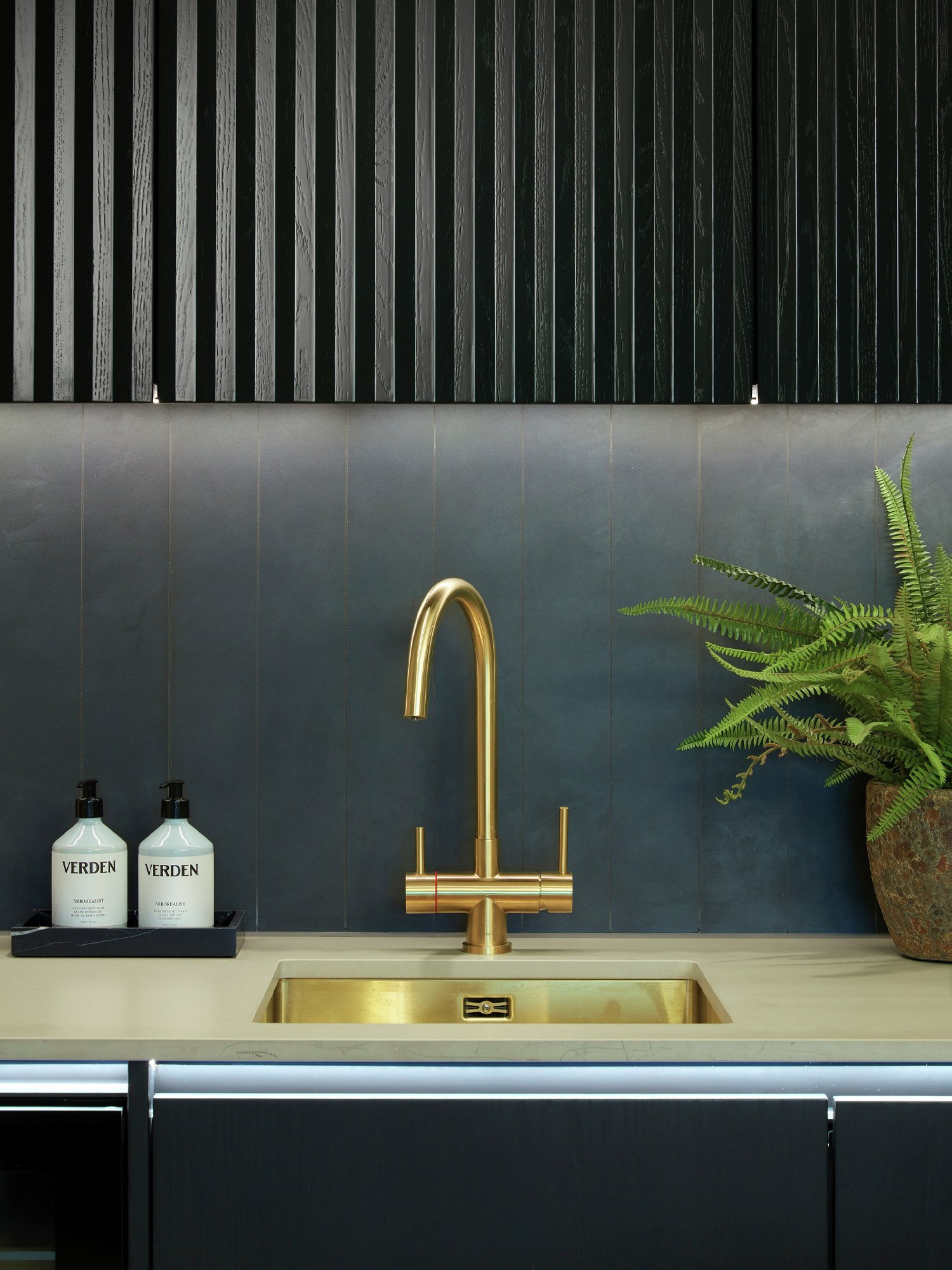
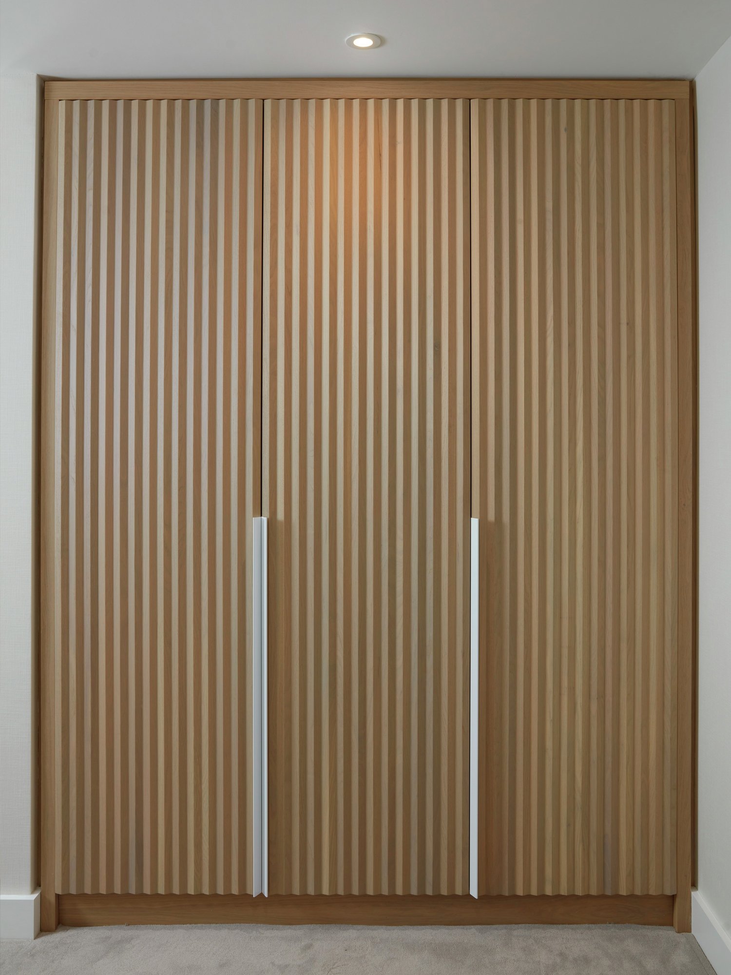
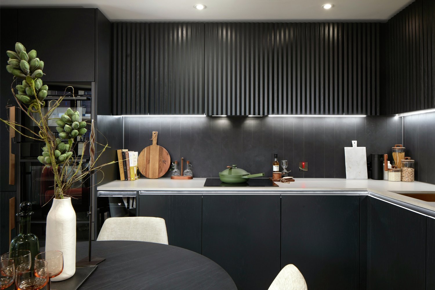
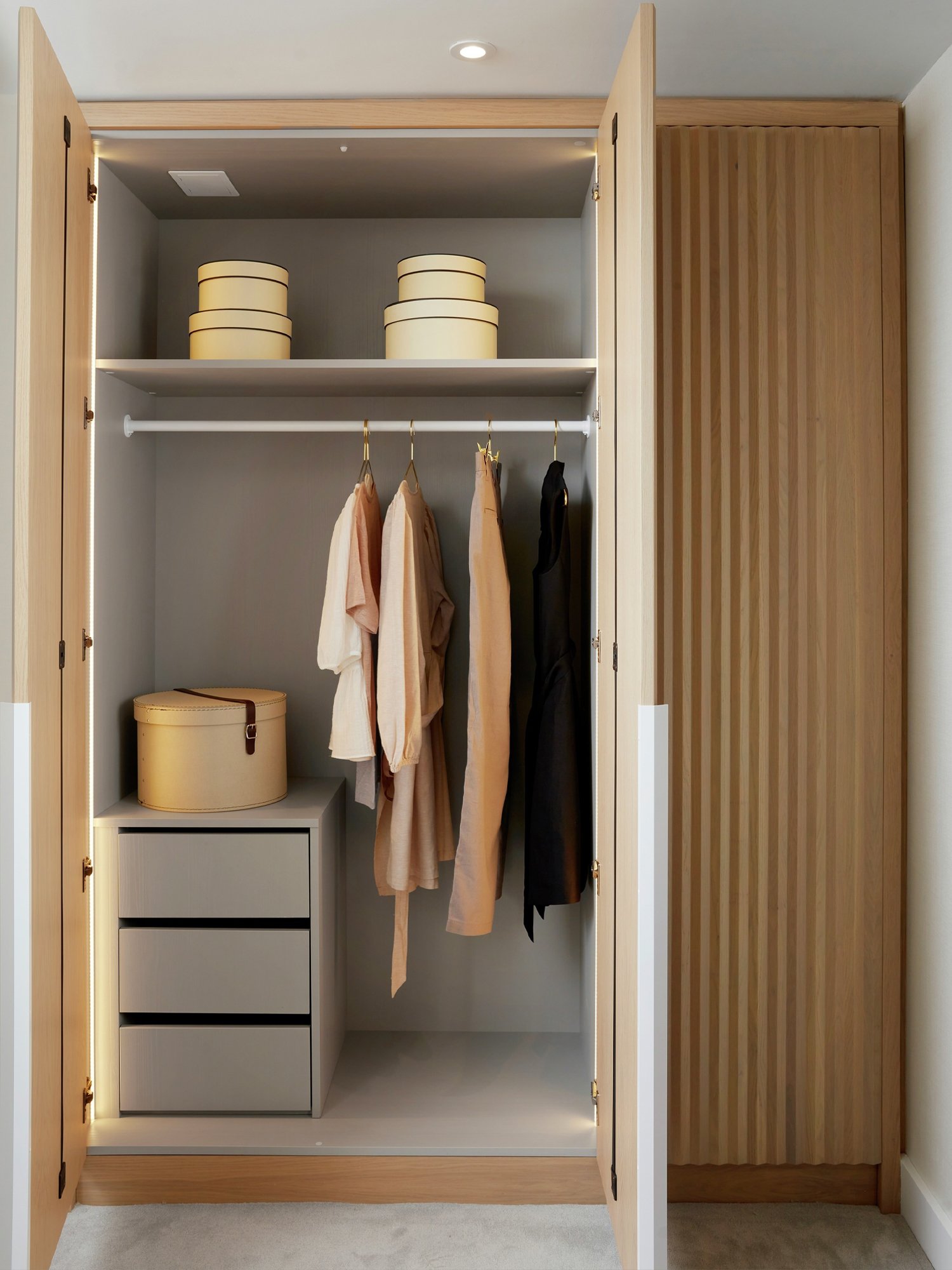
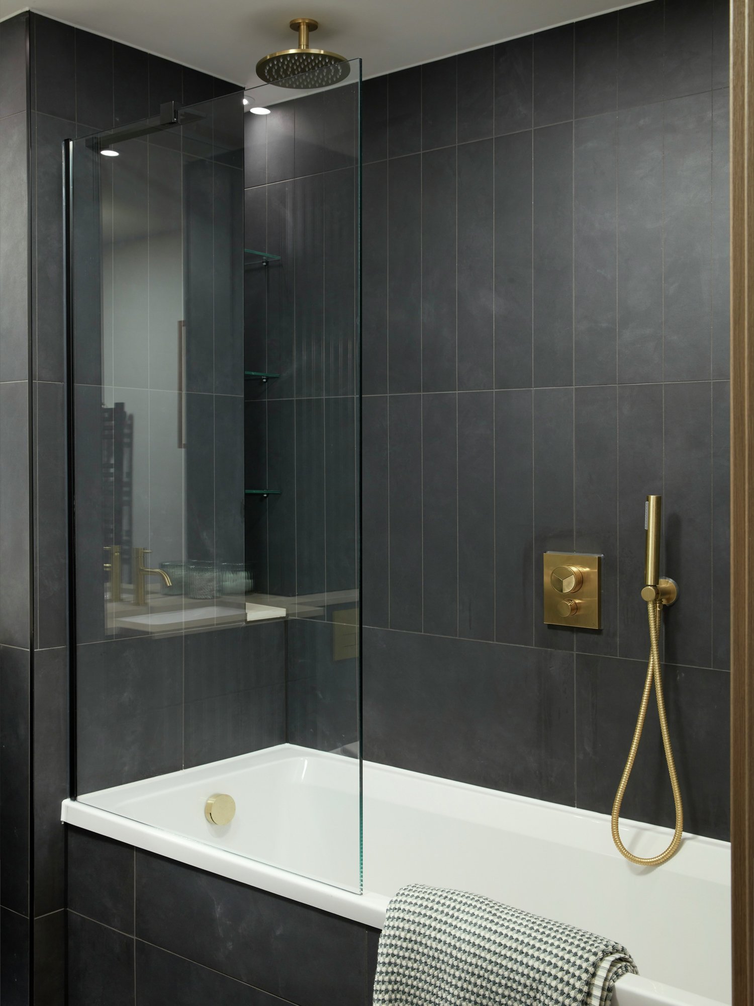
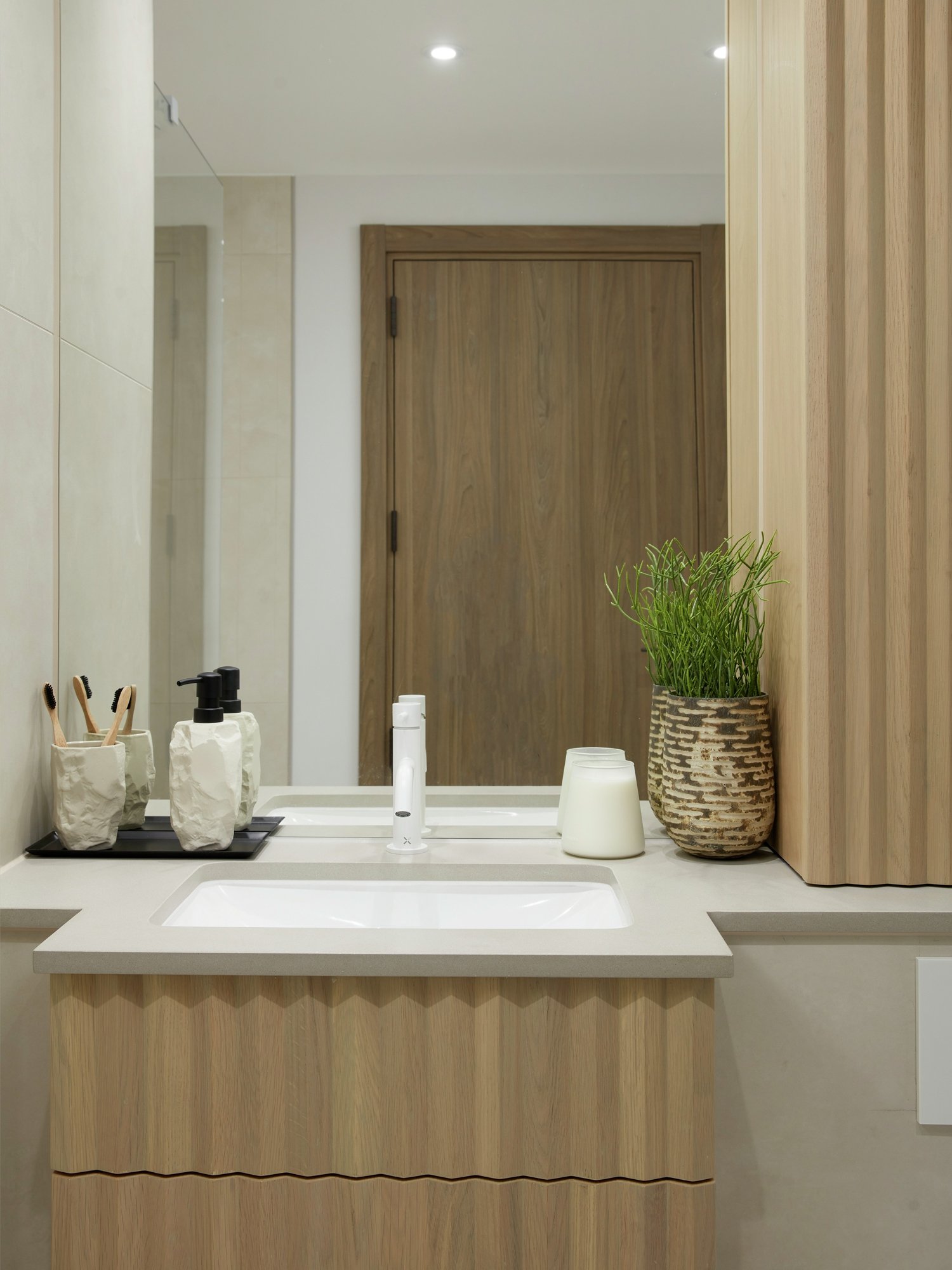
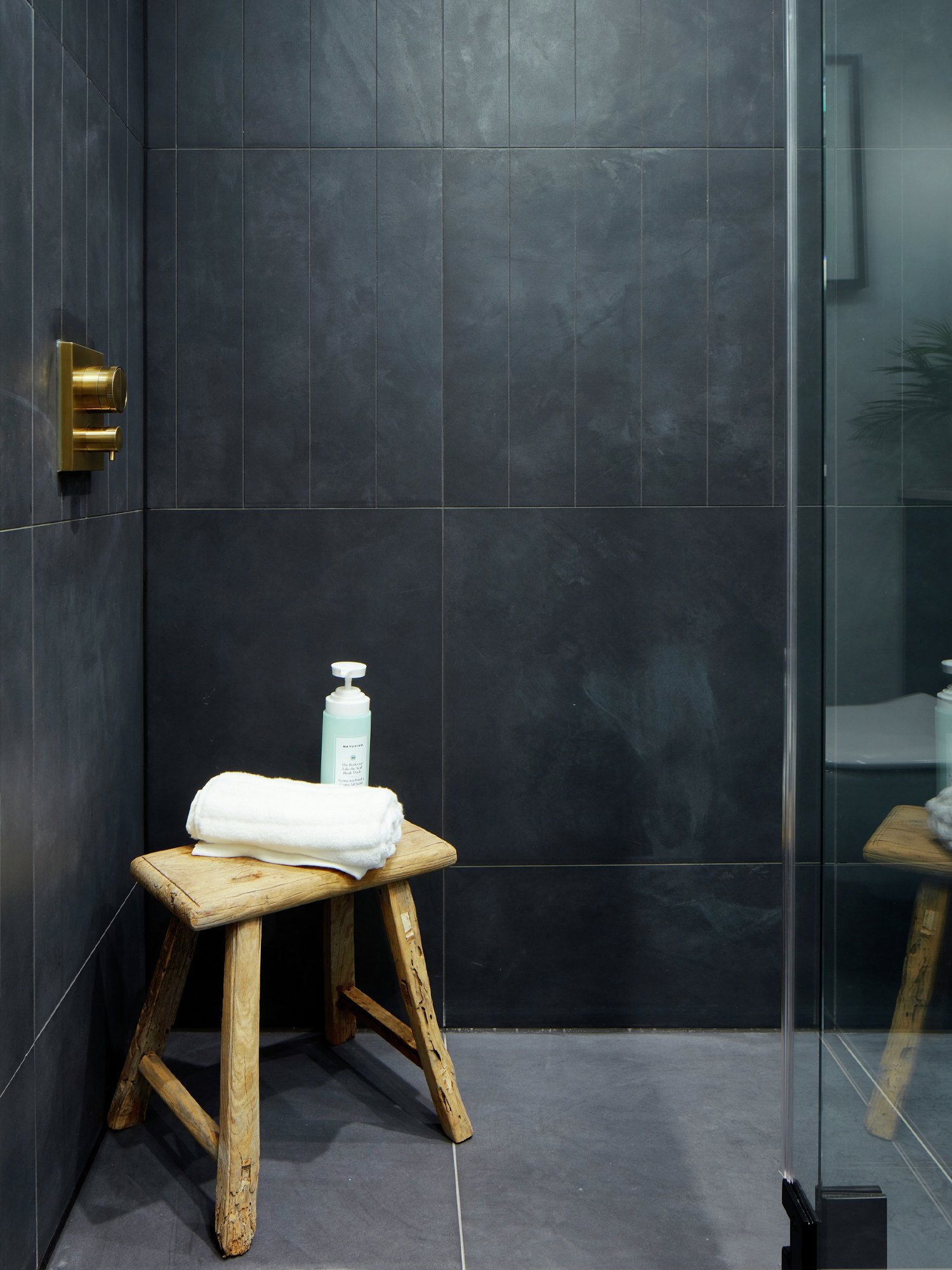
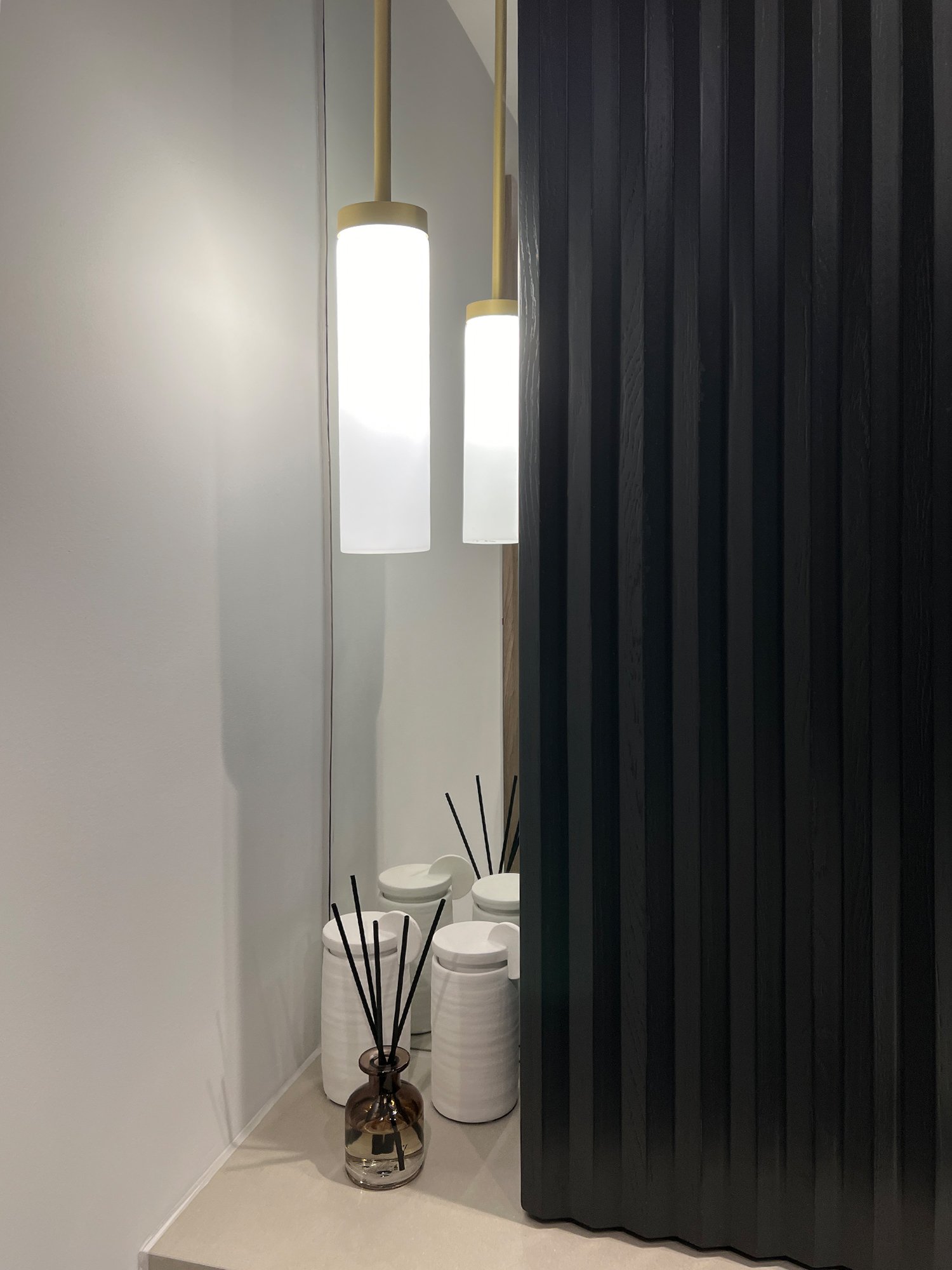
The star of the show is without a doubt the bespoke cabinetry. This was a labour of love and we’re so glad the client bought into the original vision and saw it through. The design is woven throughout the entire apartment - kitchens, bathrooms and bedrooms all get a piece of the action. The inspiration was the building façade. Running from top to bottom on all the faces is a strong triangular design detail and this has been mimicked in the heavily 3D cabinetry throughout. This is a testament to the skills of the supplier, a lovely direct link to the façade of the building and a seriously unique piece of design language that sets this scheme apart from the competition.
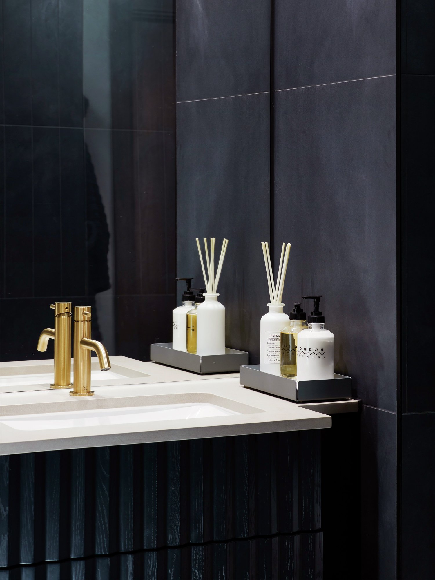
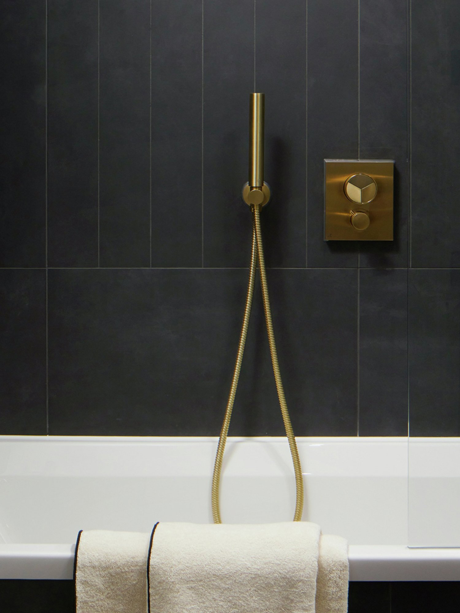
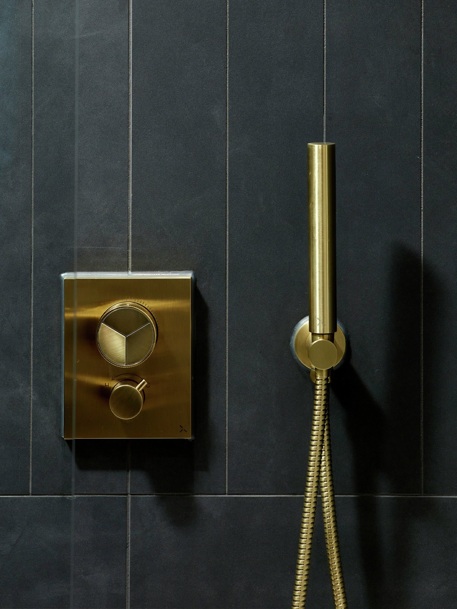
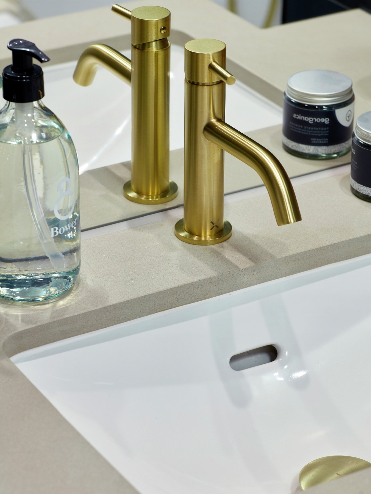
Brassware was another opportunity to create a real difference. The Dark Palette has a rich, brushed brass which creates a strong contrast to the off-black cabinetry giving the bold, private members’ club vibe the client was eager to try and emulate. The Light Palette shares all the same products but looks radically different. We’ve gone for a crisp, fresh matt white for all the brassware and this still relatively rare finish gives the apartments a really unique look, especially combined with the light oak cabinetry.
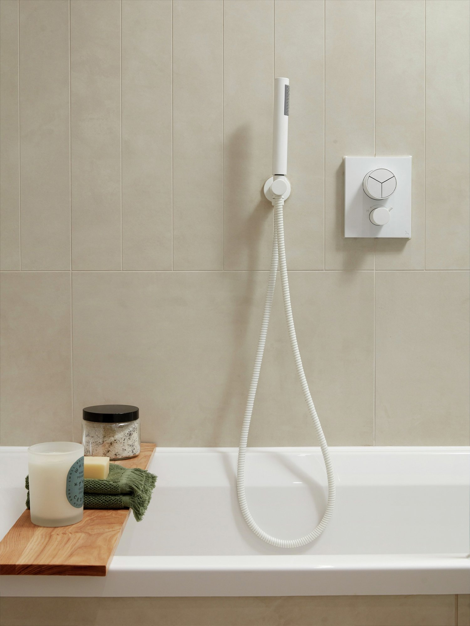
Flooring throughout the main spaces is a gorgeous smoked oak finish; we’ve managed to find a shade that works beautifully with both the Dark and Light Palette. Doors and architraves are colour-matched to the flooring and create another real point of difference. For those customers who fancy a more Mediterranean vibe, the soft, plaster-effect porcelain used in the bathrooms is available as another flooring option throughout the main spaces.
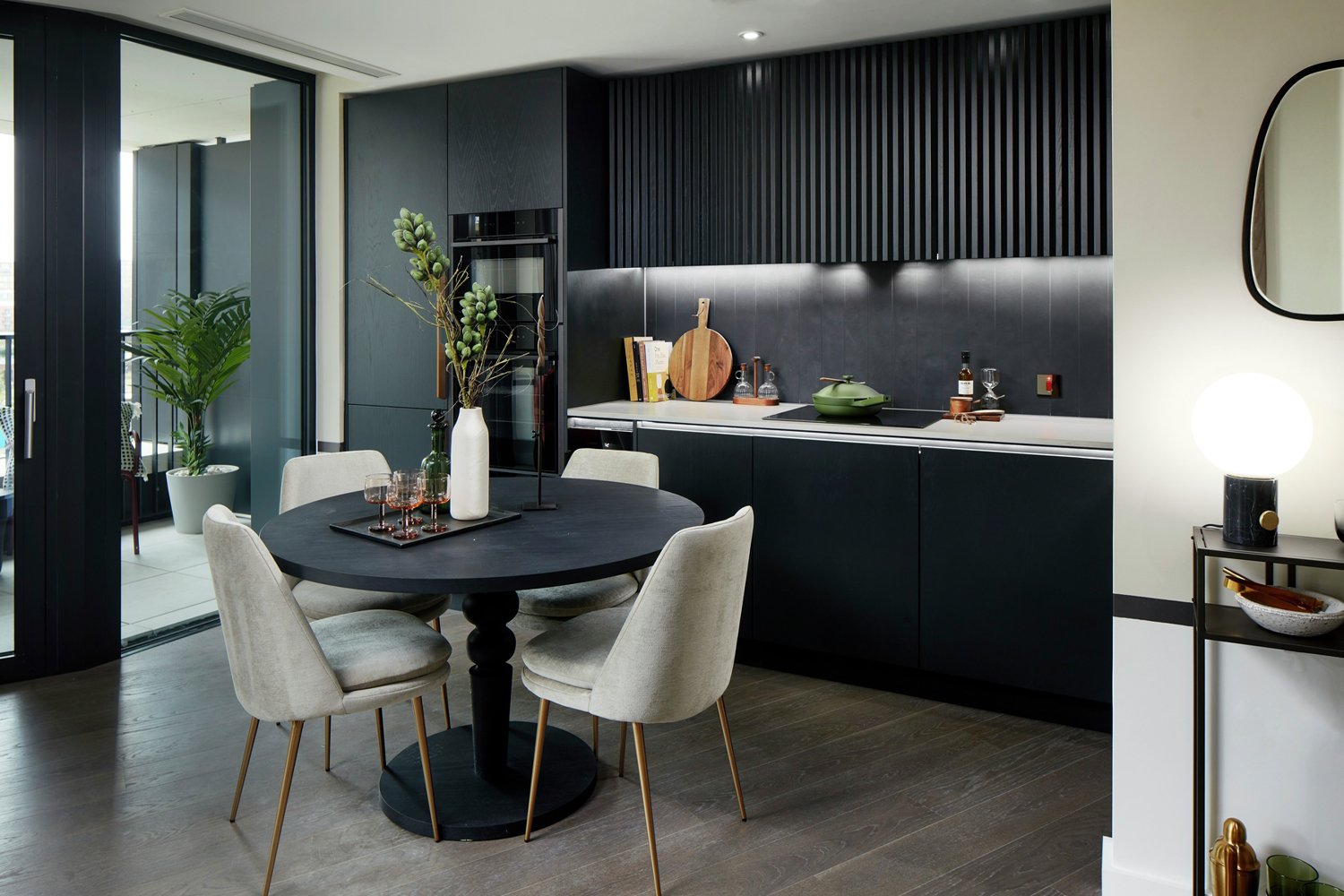
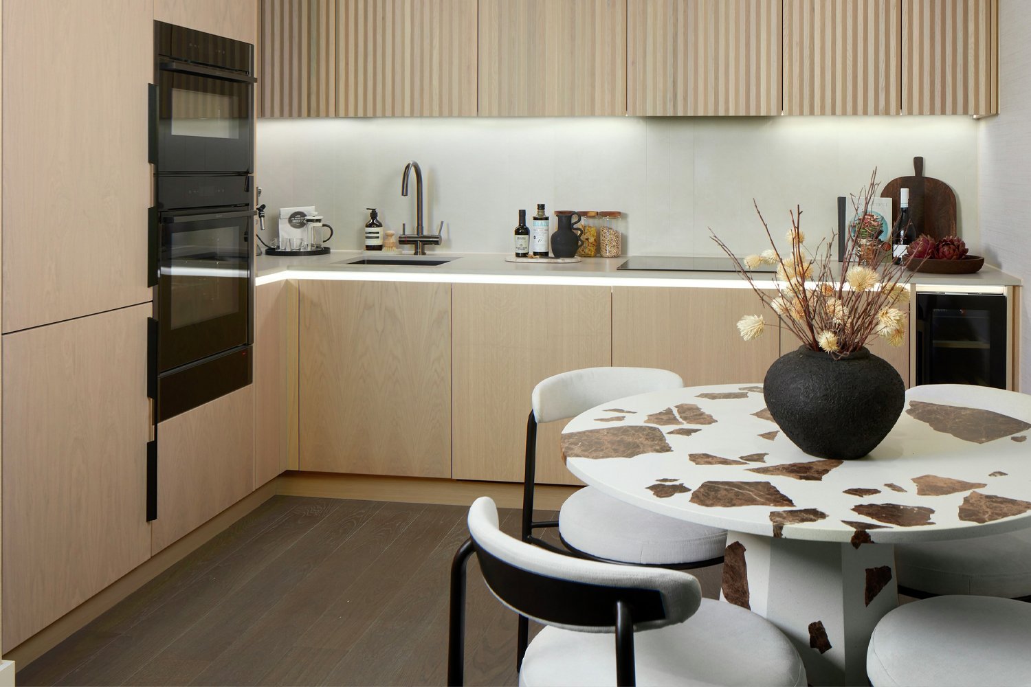
We found ourselves using the word ‘verticality’ a lot when initially presenting this scheme to the client. One look at the outside of the building says why. We always want to pull inspiration from the architecture to ensure there is a synergy between outside and in. The façade on this one was a real gift! There is a really strong vertical theme at play and the triangular detailing is a designer’s dream (assuming you know suppliers who can create your vision – fortunately we do!) We’ve taken these two ideas and really run with them throughout the space. This is what gives the really unique design DNA on the kitchen wall units. This has then been taken through into the bathroom cabinetry and then onto the wardrobe doors. Again, this is testament to our client. It would have been so easy to dumb down the design and just go for a far plainer, easier (and let’s be honest – cheaper) design. They didn’t, and my word it’s worth it. These are some of the most stunning wardrobes we’ve seen in a long time, and they are most definitely unique in the market.
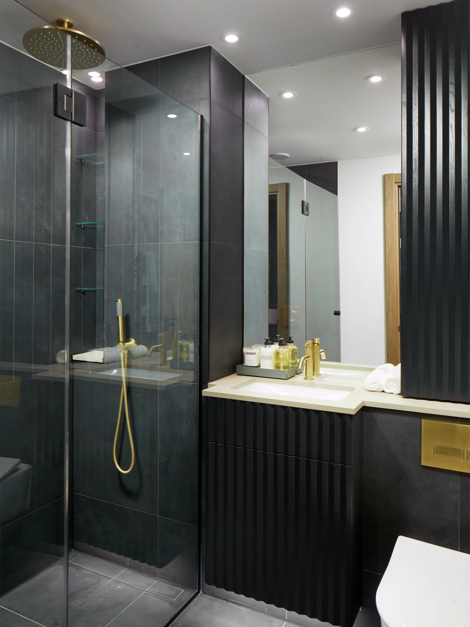
It's not just the cabinetry though, look a bit more closely and there are other nods to the vertical design language. Bespoke, skinny tiles laid vertically form a unique kitchen splashback. The same tiles are used in the bathroom as a feature, but not the obvious feature wall, instead a feature top half! Niche in the shower – check! Vertical rather than horizontal – you bet. Second matching vertical niche on the other side of the bathroom – yes, we’ve got that too. We’ve also then specced a heavily vertical, feature pendant in bespoke finishes to tie in with the statement brassware.
Designers often throw around words like unique, luxurious and aspirational, and indeed those were some of the words that were part of the initial brief to us on this job. We’re so pleased that the client trusted us on this one – we hope you’ll agree that this really has turned out to be unique, most definitely luxurious and without a doubt aspirational.
To subscribe to our monthly Newsletter and receive notification of new posts please go to SUBSCRIBE and select JOURNAL, thank you!