Colour Predictions for 2019

2019 Colour Predictions…
#2 ‘SOLACE’
26.10.18
Following on from our first Colour Predictions journal post last week we move on to the next in the line up presented by Colour Hive Limited, the colour experts behind MIX Magazine, at Decorex 2018. They profiled four key colour stories for 2019/20, Wild, Story, Solace, and Vibe, this week we are looking at Solace.
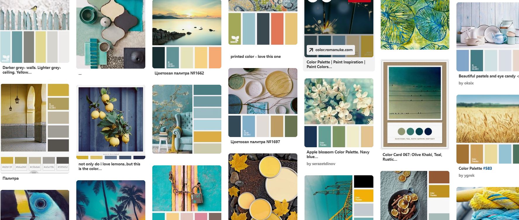
Head over to Pinterest to have a browse through some #interiorinspo that we have put together for this particular colour palette.

SOLACE Pinterest board
Solace is a respite from the busy world, embracing the colours and aesthetic of icescapes, of a place like Antarctica, far removed and (at least on the visual level) unaffected by busy modern life.
Think neutral and balanced, a study in minimalism, a measured palette of similarly muted tones. Something that Colour Hive called ‘Considered Neutrality’.
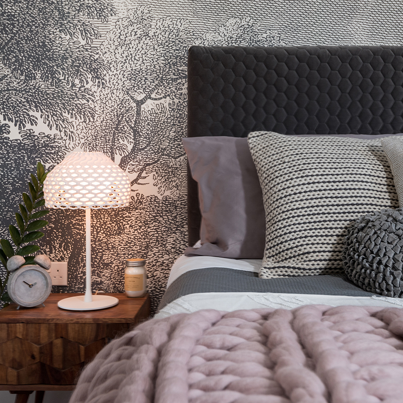
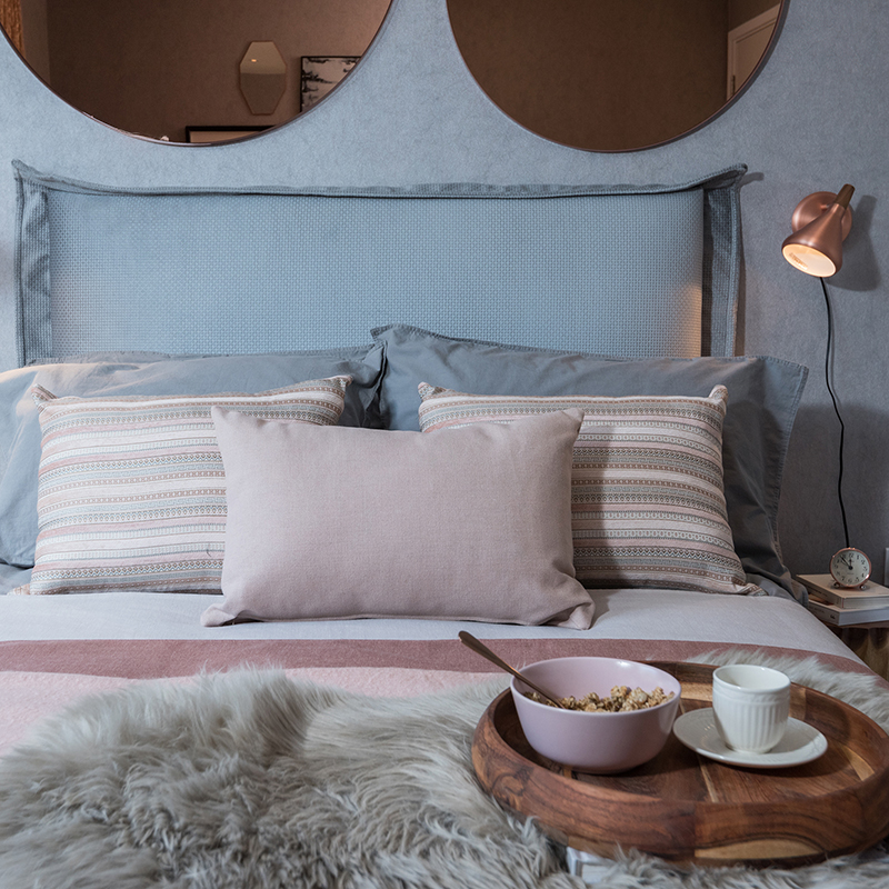
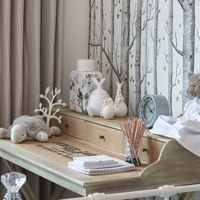
We love this idea, this search for visual peace and quiet, a move towards simplicity manifested in our day to day lives with a desire for the handcrafted, for non-branded or simply packaged products. Environment and ecology all tap into the interior aesthetic of Solace, with organic pattern and natural textures, a muted palette of blue, grey and pale pink tones reminiscent of shadows. A beautifully pared back, close-toned palette, with perhaps just a small hint of definition brought in by a maroon or a burgundy.
Here is our compilation of interiors that really taps into this colour story, and brings the tones and colours of Solace together really perfectly.
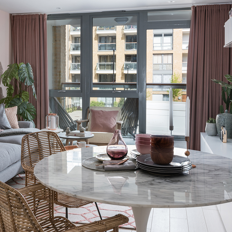
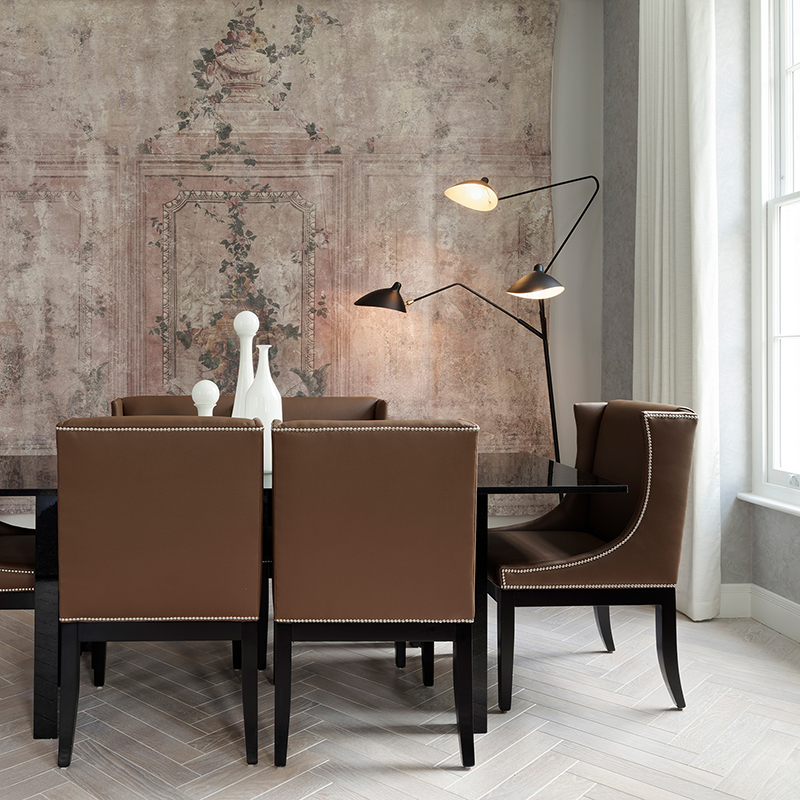
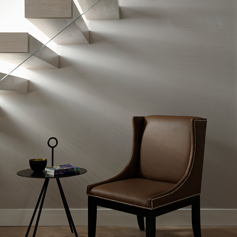
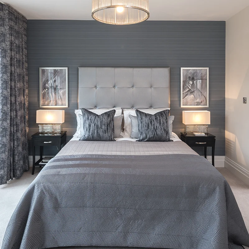
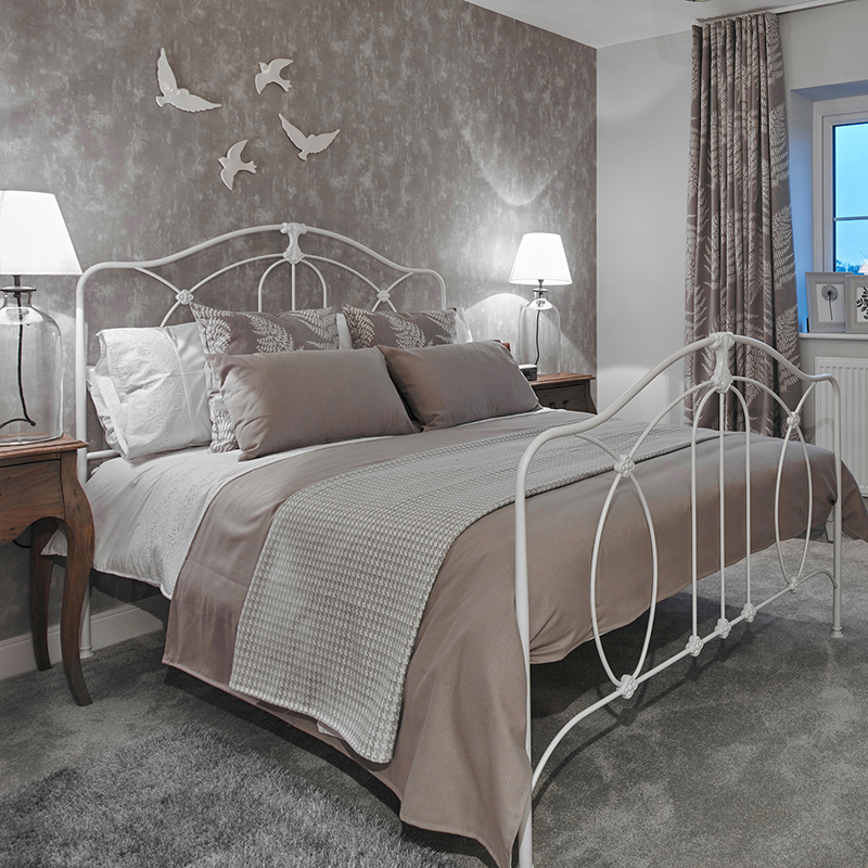
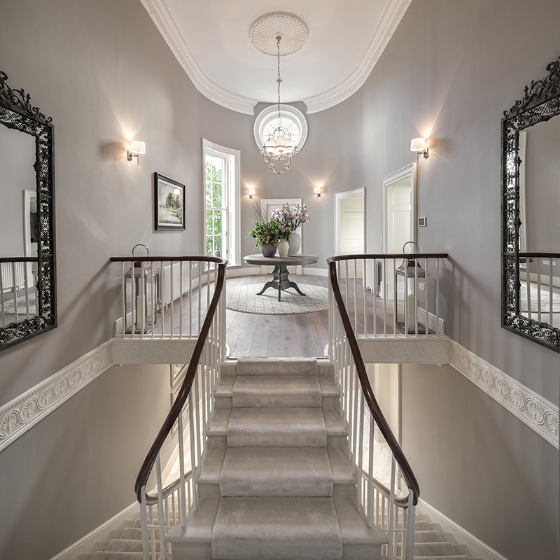
The muted tones of warm greys, the palest blues and the softest pinks make this show home for Hyde New Homes at their Packington Square development in Islington the perfect cover story for the 'Solace’ palette. All a little bit Nordic.
From the pared-back colour palette to the quality of light and shadows, this show home for Fruition Properties at their Westbourne Park Villas development taps straight into the ‘Solace’ aesthetic.
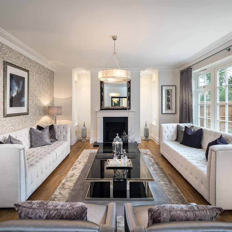
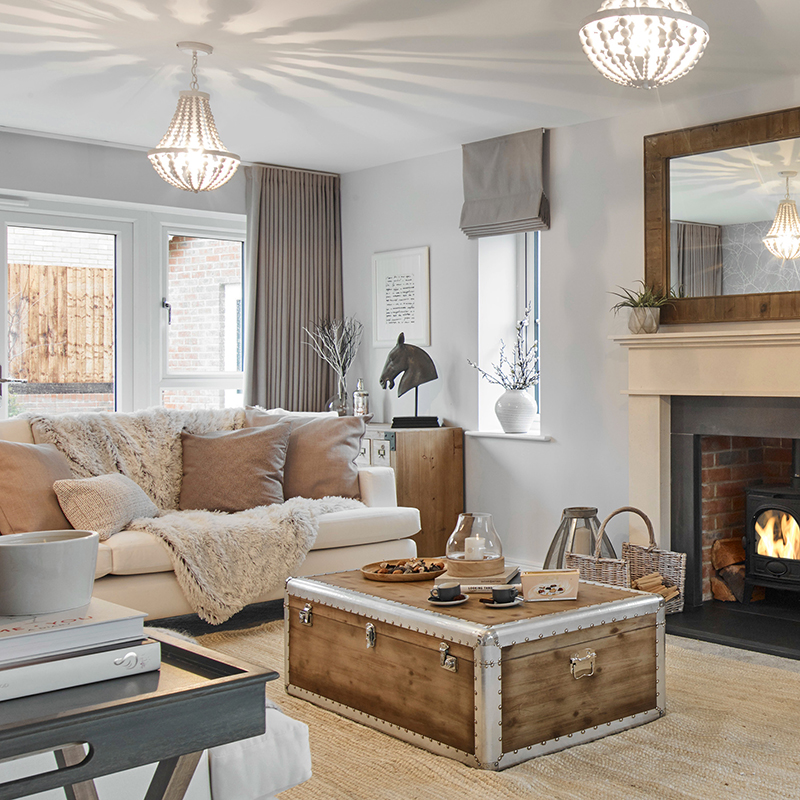
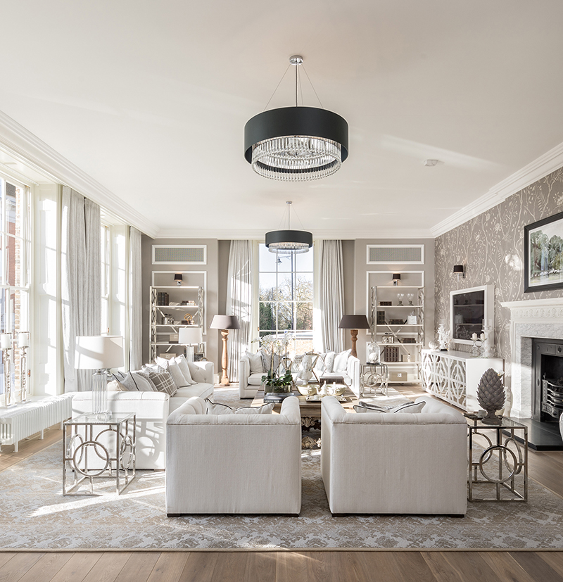
And this muted palette works just as well in larger family properties, like this large house we designed for Antler Homes at their Lansdowne Place development in Claygate.
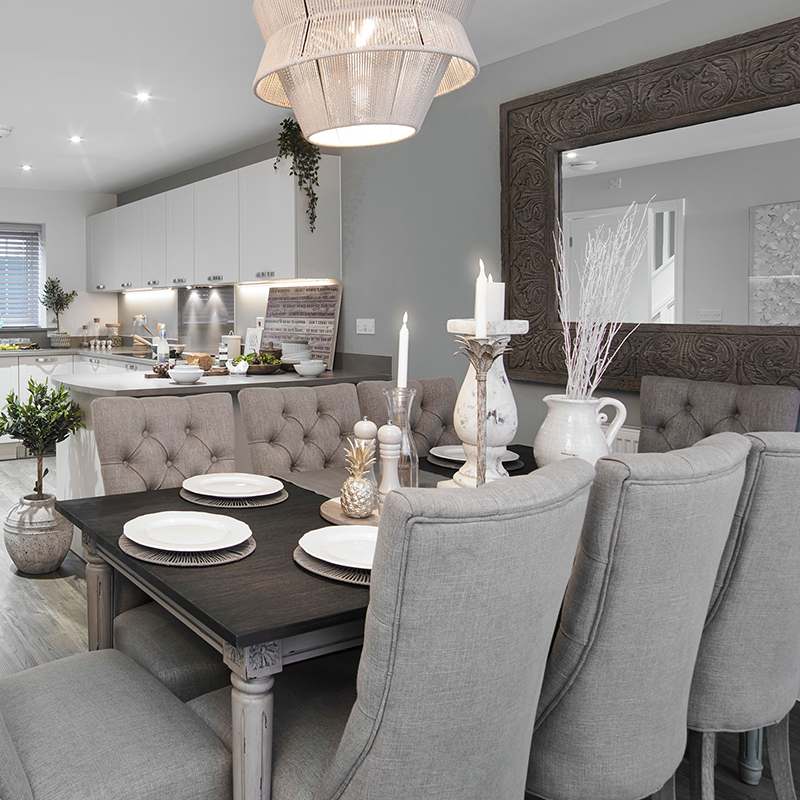
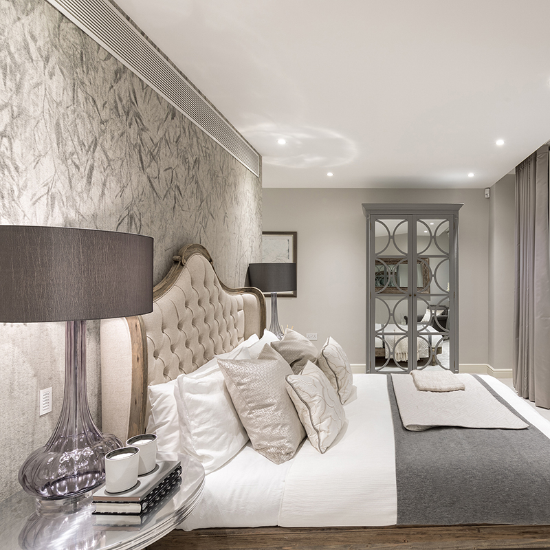
Warmed by the oak wood finishes this show home for Countryside Properties at their Herschel Place development in Hawkhurst illustrates the versatility of the colours inherent in this story.
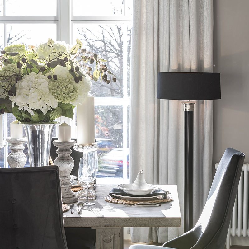
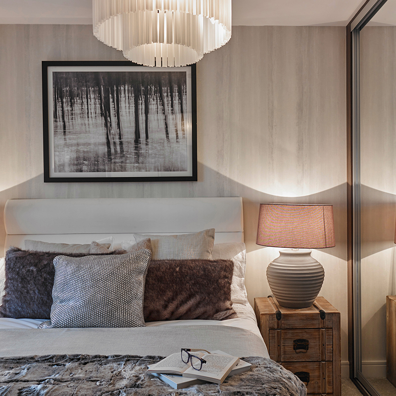
And finally, the perfect example of creating that little bit of peace and quiet amid all the hustle and bustle of urban life, we have this beautiful period townhouse refurb. Dressed with calm colours and flooded with natural light, this show home for London Square at their prestigious Ancaster Gate development in Richmond tops the bill.

‘WIld’
‘Story’
‘Vibe’